Along with being a regular Sketch Card artist for Rittenhouse Archives, I'm also currently their Talent Acquisition guy. I try and find new artists for the sets we produce and also go over many submissions. I'm not the guy who hires anyone, I'm just the first line of defense. You need to get through me to get your stuff passed on to the hiring department where I put in my recommendations for an artist. Rittenhouse and Marvel (or whichever appropriate licence owner) gets final approval of any artist.
(*Update 8/14: I am no longer Rittenhouses' Talent Acquisition guy. So no need to email me about getting work. But, I thouth I'd leave this up as it's still all good advice. Send any new submissions to artsubmissions@scifihobby.com)
In the screening process, I try to get to each and every submission and reply to all with any kind of constructive criticism that might help an artist next time they submit samples. (I'll even Redline their artwork to help make any points if I need to) In giving this advice, I find myself giving the same criticisms over and over again daily. It's really amazing which of the same problems I see from so many different artists.
I've compiled a "Top 10" of the most frequent comments I make on a daily basis. (Most of which were tweets I've made a few times before) At least here I can embellish a bit more without a 140 limit.
#10) Avoid submitting any reproduced or "homage" artwork. You know, those sketches that you need to write "after " with the original artists name before yours. I know they can draw... I'm not interested in any artists work but yours and what you can do.
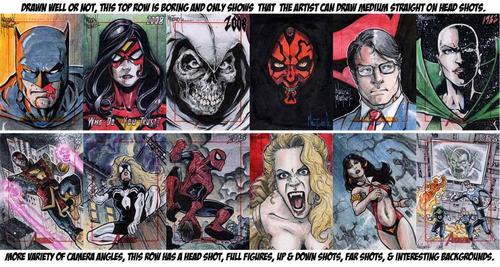
#9) Variety counts! All head shots shows the artist can't draw anything else. Just as importantly, the straight on waist-up shot couldn't be more boring. Move the camera around! There are so many interesting angles and points of view to utilize and keep everyone interested in your image.

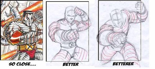
#8) I take the time on critiques and advice, sometimes drawing over sketches to better show the point. It's a good idea for the artist to take the time and let their hands learn from the advice. Rushing out new samples days later with "fixes" doesn't show you took the time to learn and add all the new tools. It may take weeks or months of actual practice.

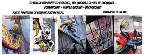
#7) Layering adds more depth to your art. Having Foreground objects in front of Middleground objects in front of Backgrounds makes all the difference. Sketchcards are limited in working space from side to side ( only 2.5"x3.5") but front to back (foreground to background) is infinite. Utilize that space.

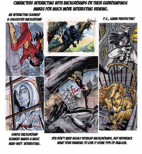
#6) Scenic backgrounds help give characters some place to be and interaction with their environment gives them something to do. That is much more interesting for the viewer.

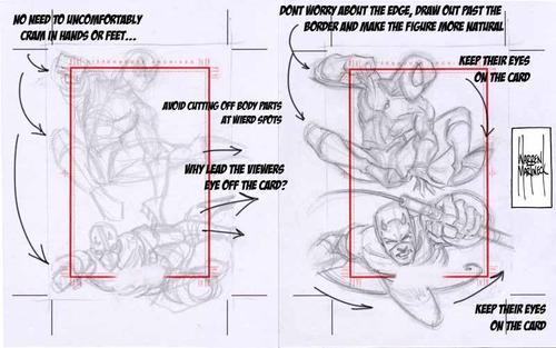
#5) Layouts: For a more natural feel draw past the border, don't oddly cram limbs in just to get them in the image. Likewise, place limbs or objects around the card in a way that keeps the viewers eyes on the card.

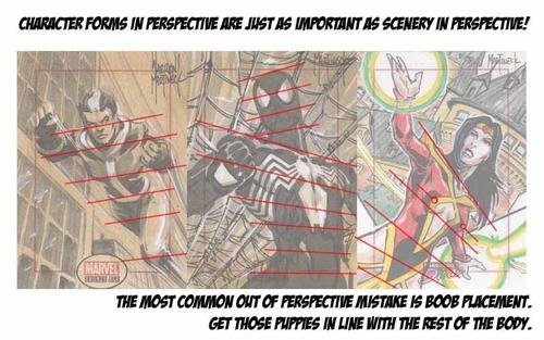
#4) Perspective: Learn the aspects of 2 and 3 point perspective and utilize it for better layouts from your backgrounds. Avoid basic 1 pt perspective. Also, perspective is just as important in the forms of characters as for scenery and buildings.

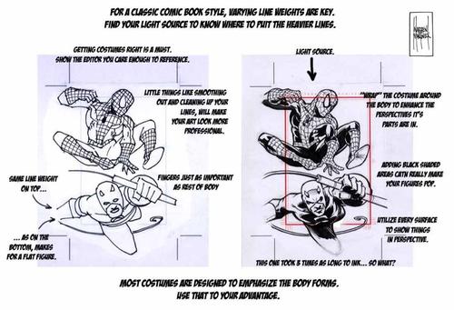
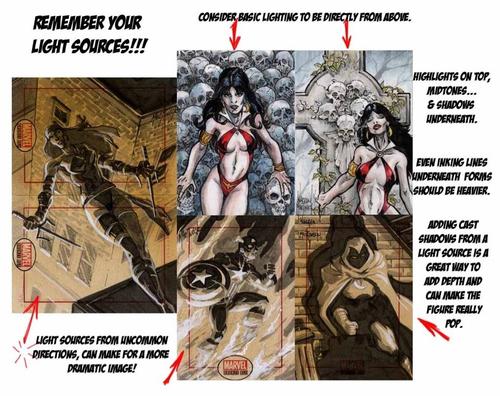
#3) For a more classic comic style inking, consider varying line weights to give more form to the characters. Remember your where your light source is!

#2) Find your Light Source! It affects line weights, rendering, forms, colors, highlights/mid tones/shadows, and can add a great graphic element to your images.

#1) FORM BEFORE DETAIL. Watch your forms. It was important enough for me to do a whole blog post about it here. Form Before Details.
I hope this helps your sketchcards or at least with future submissions in some fashion.
later
WM
____________________________________
Warren Martineck
 Wednesday, October 25, 2017 at 10:03AM
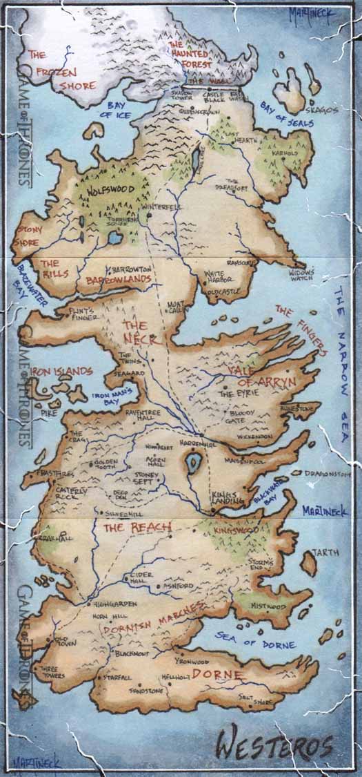
 Game Of Thrones,
  Sketch Cards
