Entries in How-to (10)

Tuesday
Sep032013

Sketch Card Submissions Advice (Rittenhouse Archives LTD)

  Along with being a regular Sketch Card artist for Rittenhouse Archives, I'm also currently their Talent Acquisition guy. I try and find new artists for the sets we produce and also go over many submissions. I'm not the guy who hires anyone, I'm just the first line of defense. You need to get through me to get your stuff passed on to the hiring department where I put in my recommendations for an artist. Rittenhouse and Marvel (or whichever appropriate licence owner) gets final approval of any artist.

(*Update 8/14: I am no longer Rittenhouses' Talent Acquisition guy. So no need to email me about getting work. But, I thouth I'd leave this up as it's still all good advice. Send any new submissions to artsubmissions@scifihobby.com) 

In the screening process, I try to get to each and every submission and reply to all with any kind of constructive criticism that might help an artist next time they submit samples. (I'll even Redline their artwork to help make any points if I need to) In giving this advice, I find myself giving the same criticisms over and over again daily. It's really amazing which of the same problems I see from so many different artists.

 I've compiled a "Top 10" of the most frequent comments I make on a daily basis. (Most of which were tweets I've made a few times before) At least here I can embellish a bit more without a 140 limit.

#10) Avoid submitting any reproduced or "homage" artwork. You know, those sketches that you need to write "after " with the original artists name before yours. I know they can draw... I'm not interested in any artists work but yours and what you can do. 

#9) Variety counts! All head shots shows the artist can't draw anything else. Just as importantly, the straight on waist-up shot couldn't be more boring.  Move the camera around! There are so many interesting angles and points of view to utilize and keep everyone interested in your image.


#8) I take the time on critiques and advice, sometimes drawing over sketches to better show the point. It's a good idea for the artist to take the time and let their hands learn from the advice. Rushing out new samples days later with "fixes" doesn't show you took the time to learn and add all the new tools. It may take weeks or months of actual practice.


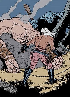
#7) Layering adds more depth to your art. Having Foreground objects in front of Middleground objects in front of Backgrounds makes all the difference. Sketchcards are limited in working space from side to side ( only 2.5"x3.5") but front to back (foreground to background) is infinite. Utilize that space.

#6) Scenic backgrounds help give characters some place to be and interaction with their environment gives them something to do. That is much more interesting for the viewer.


#5) Layouts: For a more natural feel draw past the border, don't oddly cram limbs in just to get them in the image. Likewise, place limbs or objects around the card in a way that keeps the viewers eyes on the card.


#4) Perspective: Learn the aspects of 2 and 3 point perspective and utilize it for better layouts from your backgrounds. Avoid basic 1 pt perspective. Also, perspective is just as important in the forms of characters as for scenery and buildings. 


#3) For a more classic comic style inking, consider varying line weights to give more form to the characters. Remember your where your light source is!


#2) Find your Light Source! It affects line weights, rendering, forms, colors, highlights/mid tones/shadows, and can add a great graphic element to your images. 


#1) FORM BEFORE DETAIL. Watch your forms. It was important enough for me to do a whole blog post about it here. Form Before Details.


I hope this helps your sketchcards or at least with future submissions in some fashion. 


later

WM


____________________________________

Warren Martineck

Monday
Jul092012

Form Before Detail

Form Before Detail.

Form Before Detail.

Form Before Detail!

These are the 3 most important words in basic drawing. Paint it in big letters on the wall of your studio right above your drawing table so you don't forget. 

 Everything has form... buildings, doorways, figures, trees, the leaves on the trees, the forms the leaves on the trees make when all bunched together, each section of the human finger, a piece of paper, the computer screen your reading this on... everything has form and getting the forms right on a drawing in the first place is the key to making your art so much better and much more interesting to look at.

 It's simple, lightly layout all your basic forms first. It's easier to see your basic layout and easier to erase and redraw simple light shapes plus you don't tear up / damage your drawing surface as much. It helps take away the confusion in getting the human figure into correct perspective and easier to see what looks wrong. Forced perspective becomes less of an issue. Get the forms right first, then you can spend the rest of your day adding details. 

 Here's an example, a very kind artist let me use for this, that shows  some of what I'm talking about. We have a pretty good Colossus card with laser blasts and actual backgrounds you can see and understand. There's an action pose and it's colored pretty well. But, with better form work before hand, this would have been an even better card. More and more practice on the human figure will obviously make you better at drawing it, but learning the basic forms, how they interact with each other, and putting them in perspective will get you there quicker. 

(I've used red pencil on the forms to make it so the forms and the perspective that they're in stand out more) Other than tweaking the first drawing to get the anatomy closer (especially that arm coming at the carmera), I've suggested an alternative pose that would add more movement to the piece and up the action. Another suggestion is to get that tenticle more involved in the picture. Get the forms in more dramatic forced perspective and have it popping out of the card and wrapping around and interacting with Colossus instead of being just a flat object in the background. 

Take the time, learn the art of drawing basic forms for everything and you will see a vast improvement in your art. 


Later

WM


Thursday
Mar172011

How-To #8, Sketch Cards

Probably the most frequent question I get is "How do you do them?" or "What do you use on your Sketch Cards?"  Although I have done one of these "How to's" a few years ago, I thought it was about time I did another one and this latest set, Marvel Dangerous Divas, seemed perfect for it. As posted earlier, all the cards in this set will be 2 card puzzles. I had also planned one 4-card puzzle as something a little extra special and will be using that one for this demo.

 Onward.

Yes, I do put a lot of thought into each card. I like to know what I'm drawing before I start. I'll even go as far as to set up a list of the entire set before I even start the first card. Especially on sets like the Marvel 70th or the DIvas set where I knew I was doing puzzles and wanted them themed in some way and the characters being paired up should be related in some fashion. So I'll do a lot of research before hand.

  For this puzzle, I wanted to get the Lady Liberators all together and after researching their history, I figured the newer incarnation battling Red Hulk would be the coolest. I tried laying it out with all 10 characters on 2 cards but quickly came to the conclusion that 4 cards would be even cooler. (and much easier to layout)


I decided to do the roughs on a separate paper as the card stock was some of the worst to work on. It bled and sucked up color like a sponge and I was worried that, knowing there would be a lot of erasing, I would f-up the paper even more. Sometimes you have to just shut up and deal with what you get and make it work. 

So for this puzzle I scanned my roughs, opened them up in Photoshop, rearranged, adjusted, resized, and put together the final rough on the computer and saved myself a shitload of time.


Focusing back on the card stock, I needed to prep them for the puzzle. I cut them down to size, connected, and taped them up. Through trial and error, I learned these cards needed a good spraying before hand to slow down the "sucking" process. I used a coat of Matte Finish and a coat of Acrylic Coating from cans I had lying around and this worked great when it came time to color.


Once the cards were dry, I fed it through my printer and printed out the rough in a light non-photo blue right on the board. From there I went right in with pencil to flesh out and rework bits here and there. I usually go right to inks after I tighten up things like faces and hands.


I like inking mostly with a brush and India ink as it goes quicker and you get a more permanent and interesting line than with a marker. I also tend to put in more blacks this way which always makes it look better. I save details like faces, hands, and little stuff for Microns.


I have an array of Watercolor and Ink pencils I use for the base colors and will get most of it down before I hit it with any water. I'll go in afterward with some Dyes to really punch up the color, darken areas that need it and make the contrast stronger.


Now that it's almost done, I'll go in with White Out, Graphic White, or a thick White Gouache to add in highlights or emphasize certain areas.


Once I'm happy with the finished piece (or at least when I think I've officially spent too much time on one piece) I'll sign it up, cut it down and make a good scan for my records.


 So there it is.

I do believe this will be the last one I do like this as it took some time with the pictures, scans, typing, and posting. I do believe I will be looking into setting up for Live streams and video as it looks so much easier getting it out there and I like the idea of fan interaction. (Warning: I'm a hummer when I get lost in a drawing - I'll work on it)


Thanks for following along.


Later

WM


_______________________________________________________________

Warren Martineck

Tuesday
Jul272010

CECE Promo Card #7

Tuesday, 2:00 pm
  Well, I think I've got most of the minor Flats all done at this point. Although I'm sure I'll be altering some of the color choices, I've been told not to worry about the Flat colors too much. I tend to dwell on colors right off the bat and worry about them the whole time.

Anyway, there's not much left to do before I start going in with details. This is the fun part.

Later
WM

__________________________________________
Warren Martineck

Tuesday
Jul272010

CECE Promo Card #6

Tuesday 11:00 am
  Ok, I was a little slow getting up today but I've got the ball moving and I've got  a few good hours in already.

I remembered Shard has a big Scorpion tattoo on his back so I designed and drew that separately and I'll add it as an overly later on in the color process. This is only my second or third thing I've colored on the computer and a few months since the last one, so your not getting any Artist's tips from me on this one. I've got my How to Color Comics reference book open to help remind me how to do this correctly and speed up the process.
Up to this point I've got all my main Flats in and I'm ready to continue on.

 I would love to have used this piece as a practice subject to learn how to digitally paint, as that's what I'm really interested in learning. But this has to ship out at some point.

Later
WM

______________________________________
Warren Martineck