Entries in promo card (6)

Wednesday
Jul282010

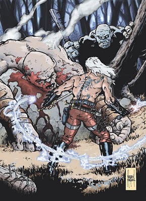
CECE Promo Card #8... and Finished.

Well, here it is. All finished, finally.
Yes, that took forever. That'll happen when your learning as you go but, I don't think it came out so bad. I would like to have had more time to fuss around with it, like tones and color variations to help pop the main character more, but maybe next time.
 I'll probably have prints made up for this as well to bring to the con and have up for sale in a few weeks.

It's been fun

Later
WM

________________________________________________
Warren Martineck

Tuesday
Jul272010

CECE Promo Card #7

Tuesday, 2:00 pm
  Well, I think I've got most of the minor Flats all done at this point. Although I'm sure I'll be altering some of the color choices, I've been told not to worry about the Flat colors too much. I tend to dwell on colors right off the bat and worry about them the whole time.

Anyway, there's not much left to do before I start going in with details. This is the fun part.

Later
WM

__________________________________________
Warren Martineck

Monday
Jul262010

How-To #5; CECE Promo Card #5

Monday 4:30 pm

  My work day seems to be based around meals, snacks, and food. Mexican strikes again as I just enjoyed a great snack of nachos. With a Diet Mountain Dew chaser to counter the effects of getting up at an unholy hour.

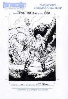
  Here's the scan of the card now fully Inked. I mostly used a brush and various sizes of Microns and now it's ready for the next stage. From here on in it will all be computer work.

  I will need to take a break at this point as the clock is telling me real life needs to start happening soon. I hope to get back to this tonight and maybe get one more post in before bed.

Until then...

Later
WM

_______________________________________
Warren Martineck

Monday
Jul262010

How-To #4; CECE Promo Card #4

Monday, 1:00 PM

 Lunch was good, lots of leftovers from the Mexican themed party we had over the weekend.

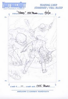
... And I decided to go with Card "A". The main reasons were; even though the action in B was better, the figure looked a bit out of control and didn't quite fit with Shards character. Card A's figure being more in control with a steady stance felt more right. The flow of the chain whip in card A also felt better and less crowded than it is in card B. On top of all that, lately, in honor of Frazetta's passing, I've been meaning to do a piece where the main subject had their back to the camera. (something he did often) Seeing as how I already have pics of shards face I thought this would be a good time to switch things up.

  What I did was take the rough in Photoshop and add it to one of my Trading Card masters that has all the measurements and crop marks all ready worked out. Here I can adjust the piece, move the figure around a bit, adjust the size or whatever. I then turn the dark pencil lines into a very light Blueline drawing and print the whole thing out on good paper. This is where I go at it with some tight pencils and figure out the little details.


I was having a bitch of a time with the dead (Ogre's?) left hand and redrew that thing over and over. I finally broke out the camera and took a ref photo to make it easier on myself. Now that I have it tight enough and to a point where I'm happy with it, I'll move on to the next stage.

Later
WM

____________________________________________
Warren Martineck

Monday
Jul262010

How-To #2, CECE Promo Card #2

 Monday morning; 5:30.
 Seeing as how I need to send out the finished artwork for the promo card this week, I needed to stop what I was working on and jump on this. As I mentioned in the previous CECE post, I'm going to post the process from start to finish and try to do it in real time.
  I've been thinking about the subject of the card for most of the weekend (while finishing up other work and doing all those weekend family functions) and wracking my brain about the what to draw.  
Then I noticed that Larry Elmore is going to be at the show and I got all excited and had flashbacks of my old D&D days. It was a time when I was seriously getting into art, planning on going to art school, and was visually absorbing any cool artwork like a sponge. There was a book I picked up of the Art Of Advanced  Dungeons & Dragons and I couldn't put it down. It was 120+ pages with 5 main artists work and a dozen or so other artists contributions. Larry was one of the artists and one of my favorites. His snow scenes were amazing.
  So, in honor and with a juiced renew for some fantasy, I thought I'd do a fantasy based card. Which works well because I have been developing a character on those lines (Shard) and most of the thought process and work is already done. You can see a bit of that development here in my Lightning Whip post.
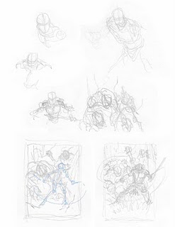
I got up this morning about 4 am (not by choice) and couldn't wait to get down to the studio to start and work out some of the images I had in my head. So I did some thumbnails and I think, or I thought, I got what I needed as you can see from the scan. I was going to go with the bottom right image, the last one I drew, of Shard facing towards the camera with destruction and dead giants or Firbolgs behind him.
 Then I went back over the lower lower left image (of Shard facing the destruction) with some blue line, to help show what I drew, just for the blog. I knew what it looked like but I'm sure it would just look like scribbles to somebody else and thought this would make it easier for everyone to see it better. In doing so, I realized I liked the look of that one too, and maybe even more than the one I decided on.

 So I'm off for some caffeine and breakfast and to think about, again, which one to do.

Later
WM

______________________________________________
Warren Martineck