Monday
Jul262010
How-To #4; CECE Promo Card #4
 Monday, July 26, 2010 at 1:26PM
 Monday, 1:00 PM
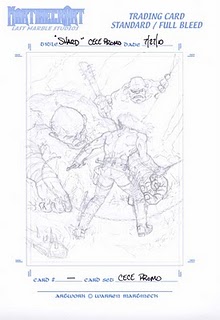
I was having a bitch of a time with the dead (Ogre's?) left hand and redrew that thing over and over. I finally broke out the camera and took a ref photo to make it easier on myself. Now that I have it tight enough and to a point where I'm happy with it, I'll move on to the next stage.
Lunch was good, lots of leftovers from the Mexican themed party we had over the weekend.
What I did was take the rough in Photoshop and add it to one of my Trading Card masters that has all the measurements and crop marks all ready worked out. Here I can adjust the piece, move the figure around a bit, adjust the size or whatever. I then turn the dark pencil lines into a very light Blueline drawing and print the whole thing out on good paper. This is where I go at it with some tight pencils and figure out the little details.
I was having a bitch of a time with the dead (Ogre's?) left hand and redrew that thing over and over. I finally broke out the camera and took a ref photo to make it easier on myself. Now that I have it tight enough and to a point where I'm happy with it, I'll move on to the next stage.
Later
WM
____________________________________________
Warren Martineck


Reader Comments